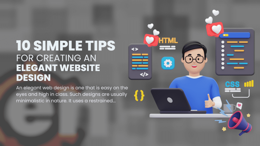
An elegant web design is one that is easy on the eyes and high in class. Such designs are usually minimalistic in nature. It uses a restrained color palette, high-quality photos and graphics, the right font and typography, and strategic white space. Discover the secrets with these 10 simple tips for creating an elegant website design.
Elegant website design: a definition
An elegant website layout takes mobile devices into account and features straightforward menus and links. Creating a professional online presence that is in keeping with the values and character of the company or brand it represents is the main objective of elegant website design.
Importance of having an elegant website design
Having an elegant website design is important for a number of reasons.
First of all, it can aid in building credibility and trust with website visitors. Elegant website designs exude professionalism and attention to detail, which can be particularly crucial for companies or brands trying to draw in high-end clients or customers.
Second, a beautiful website layout can enhance the user experience by making it simpler for site users to navigate and get the information they need. This may lengthen visitors’ stays on the website and lower bounce rates, both of which may result in more conversions and sales.
Finally, a beautiful website design can help your website look better overall, which will make it more appealing to visitors and memorable.
Tip 1: Keep the layout clean and simple
The importance of a clean layout
A nice and elegant website design must include a simple layout. It is simpler for visitors to locate the content they are searching for and traverse a website when it has a simple structure that promotes a sense of order and organization. The user experience as a whole may be enhanced by minimizing distractions and keeping the emphasis on the information.
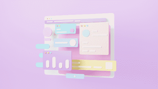
Furthermore, a clean and elegant website design can make a website appear more contemporary and expert, which can assist build credibility and trust with visitors.
Utilizing a small amount of design components and minimizing clutter, such as extraneous graphics, advertisements, or navigation links, will result in a clean layout.
How to achieve a clean layout
You may get a clean layout for your website design in a number of ways:
- Utilize a restricted color scheme: Pick a few colors and utilize them consistently throughout the website.
- Effectively utilize whitespace: Use whitespace to highlight key components and divide the site’s various sections.
- Use grid-based layouts: They can aid in establishing a sense of organization and order.
- Keep the menus straightforward: Use basic, logical navigation that prominently displays the site’s primary sections and pages.
- Use images and graphics of a high caliber: Select only high-quality, pertinent photos and graphics, and use them sparingly.
- Make use of the proper typography and font: Use good typography to establish hierarchy and emphasis key points while using a typeface that is clear and easy to read.
- Check and improve the website: To make sure the website looks pristine and professional across all platforms, test it using various browsers and devices.
Overall, a clean layout necessitates careful planning and close attention to detail, but the end result is a website that is aesthetically pleasing and simple to use.
Tip 2: Use a limited color palette
The impact of color on website design
In website design, color is important because it affects a site’s mood, tone, and overall look. Picking a color scheme that works for your company or brand is crucial since different hues can generate various feelings and connections.
In contrast, cold colors like blue, green, and purple can evoke quiet and serenity. Warm colors like red, orange, and yellow, for instance, can evoke enthusiasm and vitality.
In addition to picking the proper colors, it’s crucial to employ color effectively in the design.
For example, call-to-action buttons should be highlighted with a contrasting hue to stand out.
Overall, it’s important to recognize the importance of color in website design because it can significantly affect how users view and engage with the site.
How to choose the right color palette
An essential choice that can affect the overall appearance and usability of your website design is the color scheme you use. Following are some pointers for selecting a color scheme:
- Think about your brand identity: Your color scheme should convey the character and principles of your company or brand. For instance, you can use a brighter color scheme if your brand is lively and vivacious, while you might select a more subdued color scheme if your brand is serious and professional.
- Use a color wheel to help you decide on a color scheme. A color wheel demonstrates the relationships between various hues. For instance, you can choose colors that are adjacent to each other (known as similar colors) to create a coherent aesthetic, or you can choose colors that are opposite each other on the color wheel (known as complementary colors) to generate contrast.
- Select a small number of colors: Utilizing a small number of colors is usually preferable to using a huge number of colors. This makes the design of the site easier and contributes to its coherent appearance.
- Think about your website’s audience when selecting colors, and make sure they will be appealing to them. For instance, you can use more vibrant and joyful colors if children are your target market, while you might select subdued, elegant hues if elderly folks are your target market.
In order to select a color scheme that accurately represents your business and appeals to your target audience, much thought and testing are required.
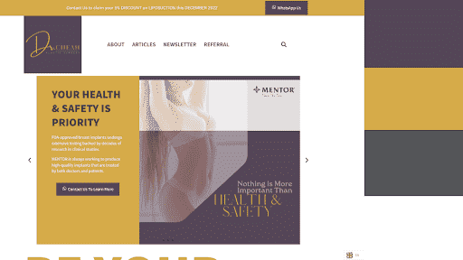
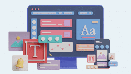
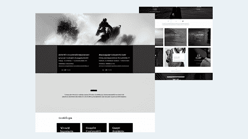
Tip 3: Use high-quality images and graphics
The role of visuals in website design
Visuals, such as pictures and graphics, are very important when designing websites. They can aid in attracting users’ attention, delivering information, and enhancing the overall look of the website.
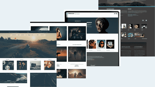
It’s crucial to select visuals for your website that are of the highest caliber, pertinent, and appropriate for your company or brand. For instance, showcasing your products with excellent product images will help customers comprehend what you have to offer.
Additionally, incorporating visual elements like icons or infographics can assist break up content and improve the site’s aesthetic appeal.
Overall, the appropriate visuals may enhance user experience and engage visitors, making them a crucial component of website design.
How to find and use high-quality images and graphics
Finding and using high-quality graphics and photos for your elegant website design is possible in a number of ways:
- Use stock photo websites: You may find a large range of stock photos on many different websites that you can use for your website. Adobe Stock, iStock, and Shutterstock are a few well-liked alternatives. Just be sure to read the terms of usage before selecting an image and make sure it suits your requirements.
- Create your own graphics and images: If you are skilled in design, you may produce your own graphics and images using Adobe Photoshop or Illustrator. If you’re looking for something distinctive and particular to your brand, this can be a suitable choice.
- Use royalty-free photos: You may find royalty-free images on many websites without having to pay a license fee for their use. To make sure you are using the photographs legally, please read the conditions of use.
- Utilize social media images: If you have a sizable following on social media, you might be able to use some of the pictures from your profiles there on your website. Just make sure you get the owner’s OK if you plan to use someone else’s photo.
- Use photos from free photo archives: There are several free photo archives, such as Pexels and Unsplash, that provide a huge selection of excellent photos you may use for your website.
Overall, to improve the overall look and efficacy of your website, it’s critical to include high-quality photos and graphics that are pertinent to and acceptable for your business or brand.
Tip 4: Use appropriate font and typography
The importance of font and typography
The readability, hierarchy, and overall appearance of an elegant website design can all be affected by font and typography, making them crucial components of website design.
Making the site more aesthetically pleasing and enhancing the user experience may both be accomplished by selecting the proper typeface and employing typography efficiently. It’s crucial to pick a typeface for your website that is both easy to read and consistent with the tone of your company or brand. For instance, a formal typeface may be appropriate for a legal company, whereas a whimsical font may be appropriate for a children’s toy store.
It’s crucial to employ typography efficiently in addition to selecting the appropriate font, such as by emphasizing points with strong text and larger font sizes or by creating a hierarchy with headings and subheadings.
Overall, font and typography are significant factors in website design since they can improve the site’s readability and aesthetic appeal.
How to choose the right font and use typography effectively
You can take the following steps to properly employ typography and the right font in your website design:
- Think about your brand identity: Your font choice and typography should convey the character and principles of your company or brand. For instance, you might select a serif font if your brand is formal and professional, as opposed to a sans-serif typeface if your brand is more contemporary and relaxed.
- Limit the quantity of fonts you use on your website: Using a lot of typefaces can make your website look cluttered and unprofessional. This facilitates a unified aesthetic and makes website design simpler.
- Think about how readable the typeface is: Select an easy-to-read typeface, especially for body text. Don’t use ornate or difficult-to-read typefaces for long passages of text.
- Effective typographic use: Create hierarchy and emphasis with typography. For instance, you can use strong text and higher font sizes for headings while using ordinary text and smaller font sizes for body information.
- Verify the typography and font: To make sure it looks beautiful and is easy to read across all platforms, test the typeface and typography on several platforms and browsers.
Overall, to reflect your brand and enhance the user experience, selecting the appropriate font and applying typography successfully take extensive thought and testing.
Tip 5: Make sure the website is mobile-responsive
The importance of mobile-responsiveness
A website’s ability to adjust to various screen sizes and devices, including smartphones, tablets, and desktop computers, is known as mobile responsiveness.
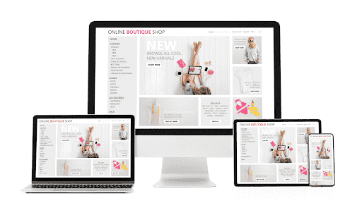
Given that more and more people are using mobile devices to access the internet, it is a crucial component of an elegant website design. A website that is not mobile-responsive may be challenging to use on a mobile device, which may result in a bad user experience and drive away visitors.
Additionally, having a mobile-responsive website is crucial for SEO (search engine optimization) reasons as Google and other search engines now give mobile-responsive websites a higher priority in their search rankings.
Overall, having an elegant website design that is accessible and simple to use for all users, regardless of the device they are using, requires that it be mobile-responsive.
How to ensure your website is mobile-responsive
You can take a few measures to make sure your website is responsive to mobile devices:
- Use a responsive design for your website: A responsive design is one that adapts to various screen sizes and devices. Techniques for responsive web design, such as the use of flexible grids, media queries, and responsive pictures, can be used to accomplish this.
- Make use of mobile-friendly design components: Use mobile-friendly design features, such as big buttons and links, and stay away from aspects that can be challenging to use on a mobile device, like Flash.
- Check the webpage on several platforms: To make sure the website looks great and is simple to use across all platforms, test it on a variety of gadgets, including smartphones, tablets, and desktop PCs.
- Utilize the Google Mobile-Friendly Test: To find out how well your website works on mobile devices and receive suggestions for enhancement, use Google’s Mobile-Friendly Test.
- Use tools like Google Analytics to track the performance of your website on mobile devices and find any areas that could use improvement.
Overall, making sure that your website is mobile-responsive involves careful design and testing, but the end result is a website that is open and simple for all users to utilize.
Tip 6: Use whitespace effectively
The role of whitespace in website design
The void space between website design elements is referred to as whitespace or negative space.
It is a crucial component of website design since it may make the site more navigable, and add a feeling of equilibrium and aesthetic interest. Effective use of whitespace can serve to highlight key features and give the site a cleaner, more polished appearance.
When creating a website, it’s crucial to think about how whitespace might be used to improve the overall look and functionality of the page. For instance, you can utilize whitespace to distinguish between various website parts or to draw attention to a call-to-action button.
Overall, whitespace serves to make websites more aesthetically pleasing and user-friendly.
How to use whitespace effectively
There are various successful ways to employ whitespace in website design, including:
- Use whitespace to clearly split the various areas of the website and to make it simpler for users to locate the information they are looking for.
- Use white space to draw attention to key components: To bring attention to crucial components, such as a call-to-action button or critical message, use whitespace.
- Use whitespace to establish harmony: Use whitespace to establish harmony in the design and prevent crowded or cluttered pages.
- Whitespace can be effectively used to add visual interest to the design and improve the aesthetic appeal of the website.
- Try using whitespace differently: To make sure the use of whitespace looks excellent and improves user experience, test it on various devices and browsers.
Overall, to make sure it improves the overall appearance and performance of the site, using whitespace properly takes careful planning and testing.
Tip 7: Use grid-based layouts
The benefits of grid-based layouts
Grid-based style, which divides the layout into rows and columns, is a common online design technique. This method can increase site usability and SEO. Grid-based website design has several advantages:
Improved Usability: By gridding the website’s content, users can simply find and browse it. SEO may benefit from increased user engagement and site time.
Aesthetics: A grid-based style can provide the website with a clean, appealing look. This can improve the site’s first impression and raise the user’s likelihood of returning.
Better Responsiveness: Grid-based layout provides for a more flexible and adaptable design, essential in today’s multi-device scene. A grid approach makes it easier to change the design for multiple screen sizes and resolutions, improving the mobile user experience.
Increased Accessibility: Grids make the website easier for disabled users to navigate. Grid-based style can also improve text-to-background contrast, making the website simpler to read for visually impaired users.
Simplified Development: Grid-based style gives web developers a clear foundation to work with, making it easier to construct a unified, well-organized design. This can reduce development time and expense.
Grid-based website design improves usability, aesthetics, responsiveness, accessibility, and development. These benefits might make your website design SEO- and user-friendly.
How to use a grid-based layout
You can adopt a grid-based layout for your website design by following a few steps:
- Choose a grid system: Choose a grid system, such as a 12-column grid or a 16-column grid, that you want to utilize for your website.
- Divide the layout into rows and columns: The site’s basic structure will be formed by the rows and columns you create using the grid system.
- Put design components inside the grid: Put the various design components—such as pictures, text, and buttons—into the grid in a way that results in a pleasing visual composition.
- Utilize margins and padding: To add visual interest to the layout and create spacing around the design elements, use margins and padding.
- Test the layout: Make sure the layout works well and is simple to use across all platforms by testing it on various browsers and devices.
To ensure that a grid-based style produces an aesthetically pleasing and user-friendly website, extensive planning and testing are required.
Tip 8: Keep the navigation simple
The role of navigation in website design
Website navigation helps users locate information and navigate the site. Proper navigation improves user experience, engagement, and SEO.
Improving User Experience: Well-organized and easy-to-use navigation can help users discover the information they need and improve their site experience. User engagement and site return may rise.
Clear and consistent navigation helps disabled users traverse the site. Users with vision impairments need consistent labels, and users with movement disabilities may need larger buttons or links.
Easy-to-use navigation helps search engines crawl and index site pages. Search engines understand your site’s structure and content better when it’s easy to traverse.
Content organization: Navigation lets you categorize and organize a website’s content. This can assist consumers to discover what they need and help search engines understand the site’s content.
Branding: Navigation can build your brand’s look and message. Navigation labels, link styles, and link grouping can represent your brand’s tone and purpose and make your website unique.
Website navigation helps visitors find content, improves accessibility, and boosts SEO. User-friendly and SEO-friendly websites have well-organized, easy-to-use, and brand-consistent navigation.
How to create a simple and effective navigation
You can follow a few steps to make a straightforward and useful navigation for your elegant website design:
- Choose the key divisions and pages: Consider how your website’s primary sections and categories should be arranged in the navigation after identifying them.
- Select a navigational method: Choose the navigational method that will work best for your website, such as a site map, a footer menu, or the main navigation menu.
- Keep the menus straightforward: Cluttered and confusing navigation can be caused by adding too many things. Instead, concentrate on your site’s most crucial primary categories and sections.
- Use labels with clarity and detail: Make sure the navigational items are clearly labeled and informative so that users know what to expect when they click a link.
- Consolidate the navigation: Make sure the navigation is consistent across the entire website so that users know what to expect when they switch between pages.
- Run a navigation test: To make sure the navigation is simple to use and functions well across all platforms, test it out on various devices and browsers.
Overall, to guarantee it is simple to use and enhances user experience, establishing an effective navigation system involves thorough design and testing.
Tip 9: Use call-to-action buttons
The importance of call-to-action buttons
The use of call-to-action (CTA) buttons on websites are crucial for promoting conversions and achieving corporate objectives.

CTA buttons are links or buttons that are intended to persuade site visitors to carry out a certain action, such as buying something, subscribing to a newsletter, or installing an app.
CTA buttons can aid in attracting visitors’ attention and motivating them to do the intended action by employing meaningful labels, contrasting colors, and prominent placements.
Additionally, by giving visitors a simple and clear route to proceed, CTA buttons can help to boost the likelihood of conversions.
In general, CTA buttons are a crucial component of website design because they can aid in generating conversions and achieving company objectives.
How to create effective call-to-action buttons
You can take the following steps to make powerful call-to-action (CTA) buttons for your website design:
- Choose the particular action you want visitors to perform when they click on the CTA button, such as purchasing something or subscribing to a newsletter.
- Use an accurate and evocative label: To ensure that visitors understand exactly what will happen when they click on the CTA button, give it a label that is both straightforward and informative, such as “Sign Up Now” or “Buy Now.”
- Use a color that stands out: To draw attention to the CTA button and make it stand out from the rest of the design, use a color that contrasts with the rest of the theme.
- Utilize a sizable, clickable button: Operate a button that is straightforward to use and can be seen by visitors.
- The CTA button should be placed in a visible place: To improve the likelihood that the CTA button will be noticed and clicked, place it in a prominent place, such as above the fold or near the end of a page.
- Test the CTA button to make sure it works well and aids in achieving the required business objectives.
To guarantee that CTA buttons capture visitors’ attention and encourage conversions, considerable planning, and testing are required when building them.
Tip 10: Test and optimize the website
The importance of testing and optimization
Testing and optimizing a website is crucial since they make sure the site is efficient and meets the required business objectives.

Testing is experimenting with various design components, such as navigation, layout, and CTA buttons, to see which ones perform best.
In order to enhance the user experience and boost conversions, optimization entails making adjustments to the website depending on the findings of the testing.
You can find and address any flaws with the site, such as usability or performance difficulties, and increase the site’s general effectiveness by conducting testing and optimization.
To make sure the site is always operating at its peak performance, testing, and optimization are ongoing operations that should be done frequently.
In general, testing and optimization are necessary to make sure a website is efficient and accomplishes the specified business goals.
How to test and optimize your website
You can take the following actions to test and improve your website:
- Establish the site’s objectives: Use the specific site objectives, such as boosting sign-ups or sales, as a roadmap for testing and optimization.
- Utilize analytics software Utilize analytics programs like Google Analytics to monitor the effectiveness of the website and pinpoint its weak points.
- Perform A/B testing Comparing various design aspects, like layout, navigation, and CTA buttons, using A/B testing will reveal which ones work the best.
- Based on test results, make adjustments: Make adjustments to the website to enhance user experience and boost conversions based on the testing results.
- Continue testing and optimizing: Testing and optimization are ongoing activities, therefore do so frequently to make sure the site is always operating at its peak performance.
Overall, thorough planning and monitoring are needed for testing and optimization to guarantee that the site is successful and meets the necessary business objectives.
Conclusion
Recap of the tips for creating an elegant website design
Here is a quick summary of the guidelines for designing an elegant website:
- Use a clear layout: Use a clear, uncluttered, and simple-to-navigate layout.
- Pick the suitable color scheme: Opt for a color scheme that fits your brand and improves the site’s look.
- Locate and utilize superior graphics: To give the site more aesthetic appeal and visual intrigue, use high-quality graphics and photos.
- Use the appropriate typography and fonts: To improve the site’s readability and appeal, pick a font and apply typography wisely.
- Adapt the website to mobile devices: Make sure the website is user-friendly, attractive, and mobile-responsive.
- Effective use of whitespace: Balance and visual appeal in the design can be achieved by using whitespace.
- Use a grid-based layout: To instill a sense of organization and order in the design, use a grid-based layout.
- Create a straightforward and intuitive navigation system to make it easy for users to travel around the website and discover the information they need.
- Utilize CTA buttons wisely: To motivate site users to do particular actions and increase conversions, use CTA buttons.
- Test and improve the website: To make sure the website is successful and meets the required business objectives, test and improve it frequently.
Overall, using these suggestions will enable you to construct a beautiful and useful website.
Importance of continuing to improve and update your website design
Your website design should be constantly updated and improved to maintain its effectiveness and help your company reach its objectives. To keep your website design fresh and improved, consider the following factors:
- Keep up with design trends: Since design trends are continuously evolving, it’s critical to stay on top of them to keep your website looking new and stylish.
- Enhance the user experience by continuing to update and improve the website. This will help visitors browse the website more easily and locate the content they are looking for.
- Boost conversions: You can boost conversions and improve business outcomes by making modifications to the site in accordance with testing and optimization.
- Maintaining an up-to-date, well-designed website will assist you to draw in more visitors and help you stay competitive in your sector.
- Reflect the brand: It’s critical to update your website to reflect changes to your brand as they occur and to make sure that it does so truthfully.
Overall, it’s crucial to keep enhancing and updating your website’s design to make sure it remains efficient and accomplishes the intended business objectives.


